Wednesday, March 27, 2013
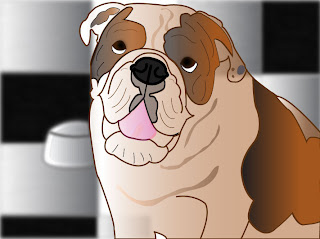
Final Graphic
This is the final project. I chose a picture of my sister Jessica's english bulldog Wilson, because I thought he would create a great looking cartoon character and also would be a bit of a challenge to create through Adobe Illustrator. While working on "Wilson", I used the pen tool to create the shape of his body, spots, creases, and any of the shapes that needed to make him look like a real dog. I had to create a lot of layers and sub layers because he had a lot of folds and different coloring in the details of him. I wanted to make him look as realistic as possible, so I made his spots and fur with a gradient to create a more organic color to his spots. To make his eyes look more realistic, I used the blur effect to his pupils. I added some texture effects to his tongue as well, instead of it just with a plain pink color. In the photograph, which my sister actually took with her camera, she made Wilson stand out in focus and the background of the bathroom was blurry. I wanted to create this same effect in the illustration of Wilson as well, so I created a layer with the black and white tile. I also added the food bowl that was behind him in the picture. Then I altered the blurriness of the background until Wilson stood out more in the picture and it didn't hurt too much on the eyes. Before I had just put lines for his wrinkles in his body, but then I ended up making shadows for the lines and giving it a more "3D" look. I spent a lot of time fixing minor details and going back in forth with colors because it was hard to get them to look just like it in the picture. Overall, I learned a lot from using Adobe Illustrator and really can appreciate the work that others do in it because I realize how much time it takes to do just a single picture at a time.
Monday, March 25, 2013
Monday, March 18, 2013
Exquisite Corpse
This project reminded me of coloring in a coloring book, which I always enjoyed. The idea that I was tracing the image and creating a picture and coloring it in was fun because I was creating the actual image that would be in a coloring book. This assignment was a little more difficult than the logo one because there was a lot more detail that you had to be careful about when outlining the image. I'm just starting to get used to Adobe Illustrator so this project helped me out a lot. It helped to think as the image and put it into shapes and layer each one on top of the other. The layering of the images gets confusing at times for me, but eventually I was able to figure it out. The tool I used the most was the pen tool. I find this the easiest to use because I can create the curves that I want to trace along the graphic. I tried using the pencil tool for some of the details, like the hat for example, but that can make the graphic look a little wobbly so it's important to only use the pencil tool when you want it to look unique and give it a 'natural' effect. I think that my exquisite corpse turned out pretty good, I do have to get used to the tools more though. I like the pathways tool where you can divide the sections and delete certain shapes as you go along. I also tried to make the colors bright and work well with each other.
Tuesday, March 5, 2013
Final Product
This is the finished product of my logo for my cake business. The cake part was fairly easy for me to do as well as the letters. I did it with the pen tool and the circles on the cake, I used the oval tool. I really liked making the W and the heart connect, giving it a fancy and creative look. The W probably took me hours to try and perfect just to get it right. Because it is overlapping the top of the cake, I wanted it to stand out so the color had to be exactly right and getting the line thickness was very hard at first but I think I adjusted it to the point where it is visible and readable. In the end I was very happy with how my logo came out. The critiques from the class helped a lot! And I think that this would look great on a business card, as well as a website. That would be my next step. I'm excited to get started!
Monday, March 4, 2013
Subscribe to:
Comments (Atom)


